Published: Jul 23, 2019 by C.S. Rhymes
I’ve been meaning to write about some of the new features I have been rolling out to my Jekyll theme, Bulma Clean Theme, for a while but I have only just managed to push the update for the landing page layout last weekend. This article provides some of the thinking behind the updates, as well as a brief introduction to how to get started.
Product Pages
I use the theme to power my own personal website and decided that it would be good to update my book pages, or book page as it was then. The page had used a very simple layout with both books on one page and was not really up to scratch. I decided it would be better to make each book its own page, and if I ever get round to it and write another book it would be easy to add another to the site in the future. Rather than just building these pages for my own site, I thought it would be a nice addition to the base theme.
I really like Jekyll as it is simple to use, but also very powerful. I decided to make the most of the frontmatter and allow you to set most of the product information in there, leaving the main content of the page for the text description.
To get started, create your product pages inside a _products directory as we will make use of collections later on.
The below is an example of the frontmatter for the product page. The product page uses the same hero, title and subtitle settings as other pages, but has additional settings for product code, image, price, rating and features. The product code is important for later on.
---
title: Product 1 Name
subtitle: Product 1 tagline here
description: This is a product description
hero_image: /img/hero-img.jpg
product_code: ABC124
layout: product
image: https://via.placeholder.com/640x480
price: £1.99 + VAT
features:
    - label: Great addition to any home
      icon: fa-location-arrow
    - label: Comes in a range of styles
      icon: fa-grin-stars
    - label: Available in multiple sizes
      icon: fa-fighter-jet
rating: 3
---
The features provides a way of making a bullet point list of the key product features, but instead of plain disc bullet points you can use font awesome icons to make it a bit more interesting.
I don’t know about you, but sometimes I spend longer deciding on what icon to use than making the rest of the page.
I’ve deliberately made the product pages have a 4 by 3 image ratio as I feel it works best across different screen sizes. Like all themes, if you want to change it you can override the default layouts if you want a different ratio.
Once you have created your product pages, you will need to tell Jekyll to output them. This is done by adding collections settings in the _config.yml for your site.
collections:
  products:
    output: true
    layout: product
    image: https://via.placeholder.com/800x600
    show_sidebar: false
Now when you run jekyll build it will output a load of product pages for you, now we just need a way of getting to them. This is where the product category page comes in.
Product Category
Create a page, such as products.md or in my case books.md and set it to use the product-category layout. This will generate a list of the products, but you can also add some introduction content in the main content section of the page if you so desire.
---
title: Products
subtitle: Check out our range of products
layout: product-category
show_sidebar: false
sort: title
---


This is some page content and it will appear above the product list.
Product Reviews
The last addition to the product pages is reviews. If you would like to list some customer reviews on your product pages, then you will need to create a reviews directory inside _data and create a separate file for each product with reviews, named after the product code. For example _data/reviews/ABC124.yml
The data file should follow the below format. The name is the customer name, the rating is how many stars out of 5, the title is the main title of the review and the avatar is a link to an image, if you have one. If you don’t have a customer image then just omit it and a user icon will be used instead. Lastly, the description is the main content of the review.
- name: Mr E Xample
  rating: 4
  title: Great product, highly recommended
  date: 01/01/2019
  avatar: https://bulma.io/images/placeholders/128x128.png
  description: >
    The product worked really well. I would recommend this to most people to use. Delivery was quick and reasonable.
    Would recommend this to my friends.
- name: Mrs R E View
  rating: 5
  title: Nice, really liked this
  date: 02/02/2019
  description: >
    The product worked exactly as described.
Example product category and product pages can be seen on the theme’s demo site here if you want to take a look.
Landing Page Layout
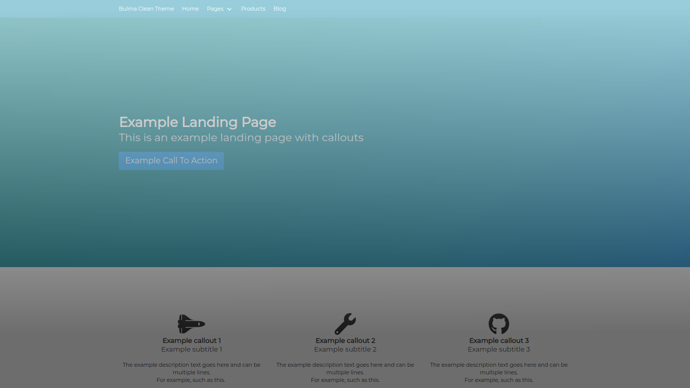
I was thinking it would be good to create a landing style page so I could highlight a new project or something I was working on separately from the main projects page already on my site. Rather than create a new layout I thought it would be better to enhance the existing page layout so you could choose to use these features if you so desired.
I started by adding a call to action (otherwise known as a large button) in the hero at the top of the page. This can be used by adding hero_link and hero_link_text to the frontmatter.
---
layout: page
title: Example Landing Page
subtitle: This is an example landing page with callouts
hero_height: is-large
hero_link: /page-1/
hero_link_text: Example Call To Action
---
Next, I wanted to make some nice callouts to help shout about key features of whatever you are talking about on your landing page. This started out as a simple icon and a title, but slowly evolved to allow for a subtitle, description text and a call to action button as well.
To make it more flexible, only the title and subtitle are required and the rest can be used as and when necessary.
To make the callouts reusable in different pages on your site, the content is defined in a datafile, for example, example_callouts.yml. The below shows the example structure for the callouts.
style: is-light
items:
  - title: Example callout 1
    subtitle: Example subtitle 1
    icon: fa-space-shuttle
    description: >
      The example description text goes here and can be multiple lines.

      For example, such as this.
    call_to_action_name: Call to action 1
    call_to_action_link: /page-1/
The style is the style of the hero that the callouts are contained in. This makes use of Bulma hero styles.
Then to display the callouts on the page, add a callouts setting to the pages frontmatter with the name of the data file without the extension.
---
layout: page
title: Example Landing Page
subtitle: This is an example landing page
callouts: example_callouts
---
An example landing page layout can be seen in the theme’s demo site.
What do you think?
I’ve tried to make these additions easy to use and flexible where possible. I’ve updated the readme file and the theme demo site with more information to help you get started with these new features.
If you decide to give the theme a go, it would be great to see how you are using it and if you have any ideas of how it can be developed further. You never know, if I get enough responses then I may even make a showcase page on the demo theme site to highlight how others are using it.


